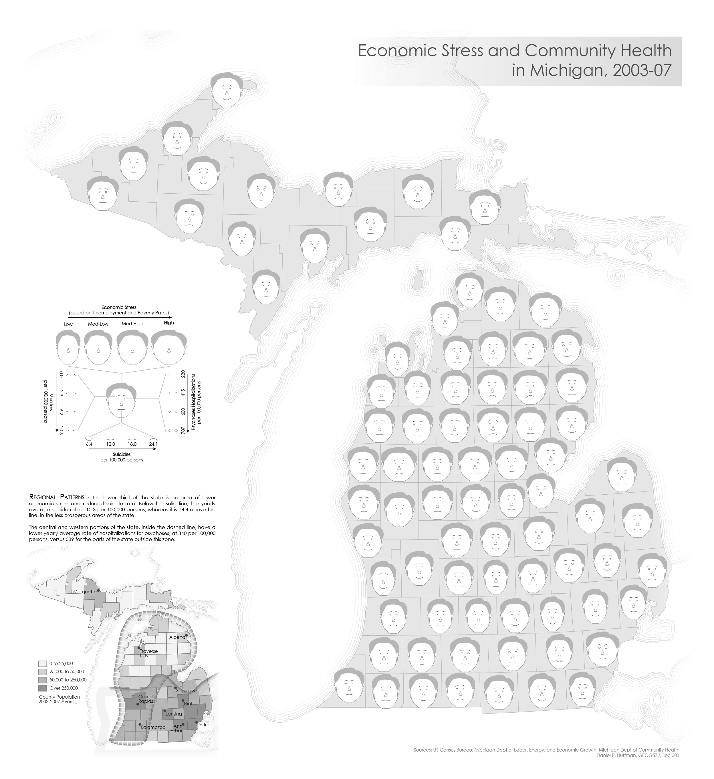
Unclassed Chernoff Faces
December 2009I have a lot of problems with how Chernoff symbols are used, and I wanted to address some of those problems in this project. One of the big reasons to use Chernoff faces is because they help humanize the data. But a lot of Chernoff maps have overly cartoonish looking faces. Mine are still abstract, but I think they look a bit more human than, say, the ones in Eugene Turner's map of life in Los Angeles.
The other big problem I’ve seen is when the variables shown on the faces don’t match up with the concept of a face symbol, such as (to make up an example): “The size of the left eye indicates how popular fishing is, while the shape of the face indicates how many people work in agriculture.” If I am going to build a symbol which varies things like facial expressions, it should convey data that have an emotional connection, such as homicide and suicide, in this case.
I’m not wholly satisfied with the results; dealing with faces opens up so many emotional and political connotations. But it was a good experience.
The other experiment I conducted here was eliminating the neatline and fading the map into nothingness at the edges. I think the inset map and the main map stand fairly well apart, despite the lack of a hard separator.