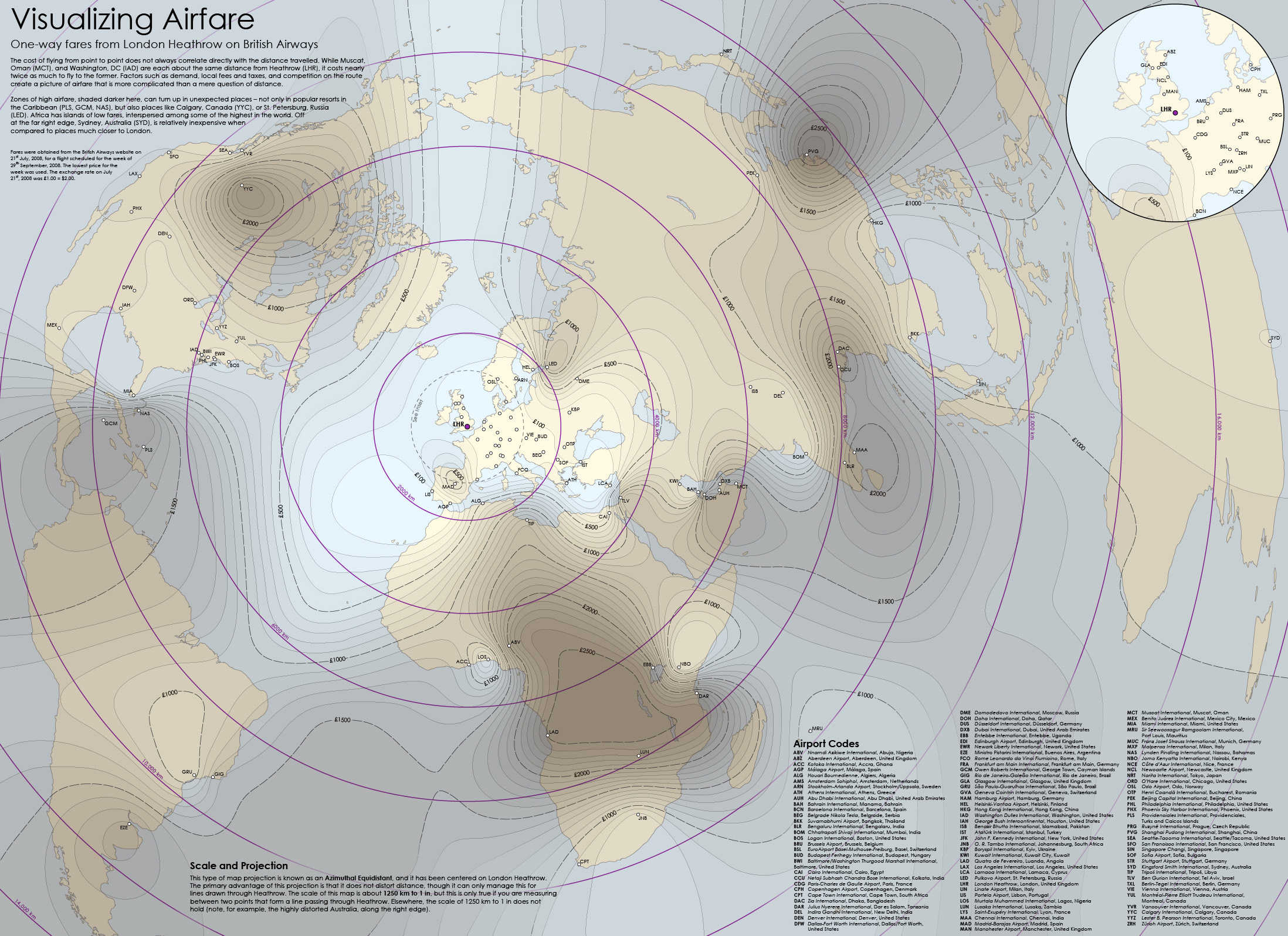
Visualizing Airfare
August 2008Featured in Cartography Design Annual #2 (2009)
Runner-up, 2008 Arthur Robinson Award for Best Printed Map
Honorable Mention, NACIS 2009 Student Map & Poster Competition
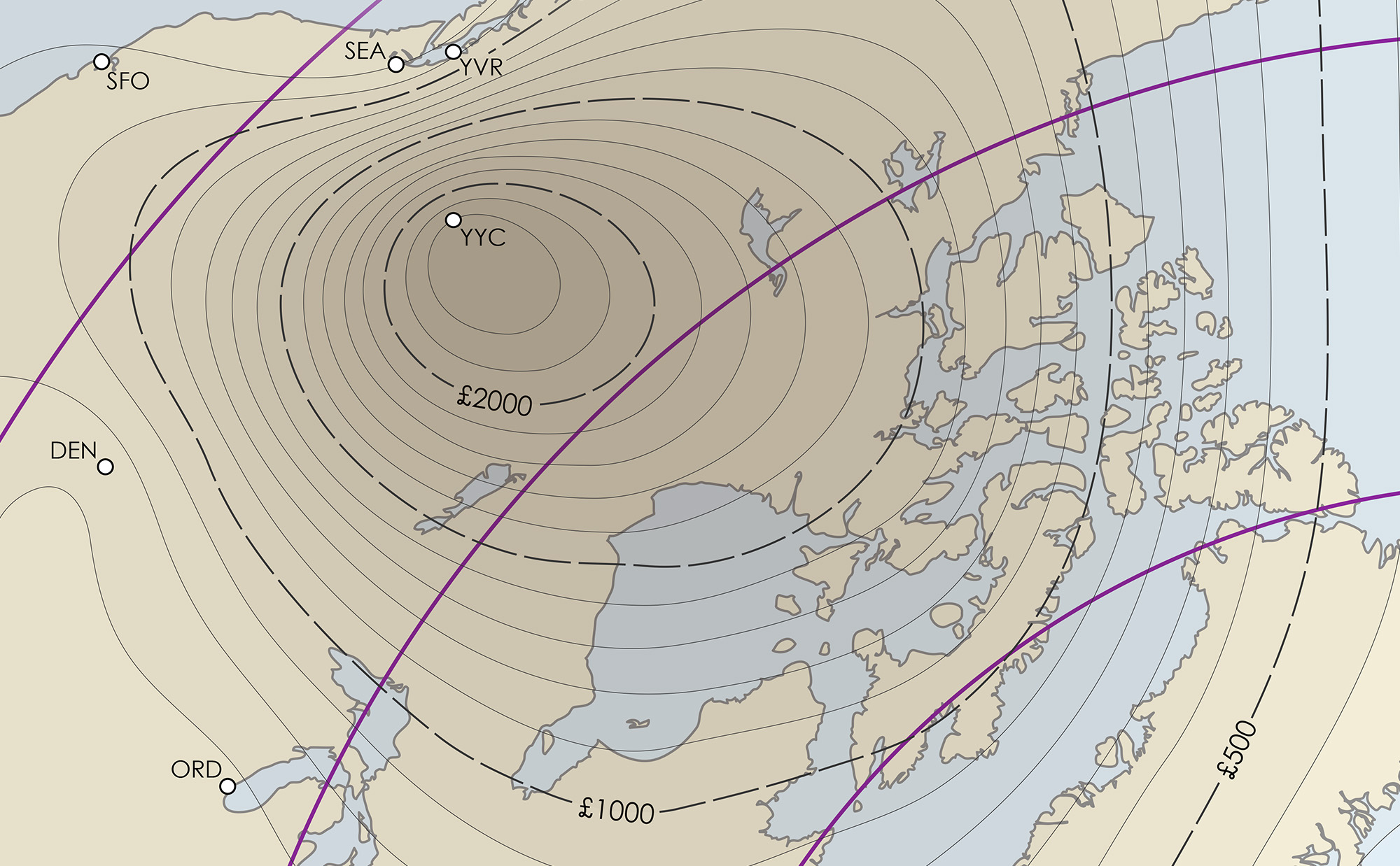
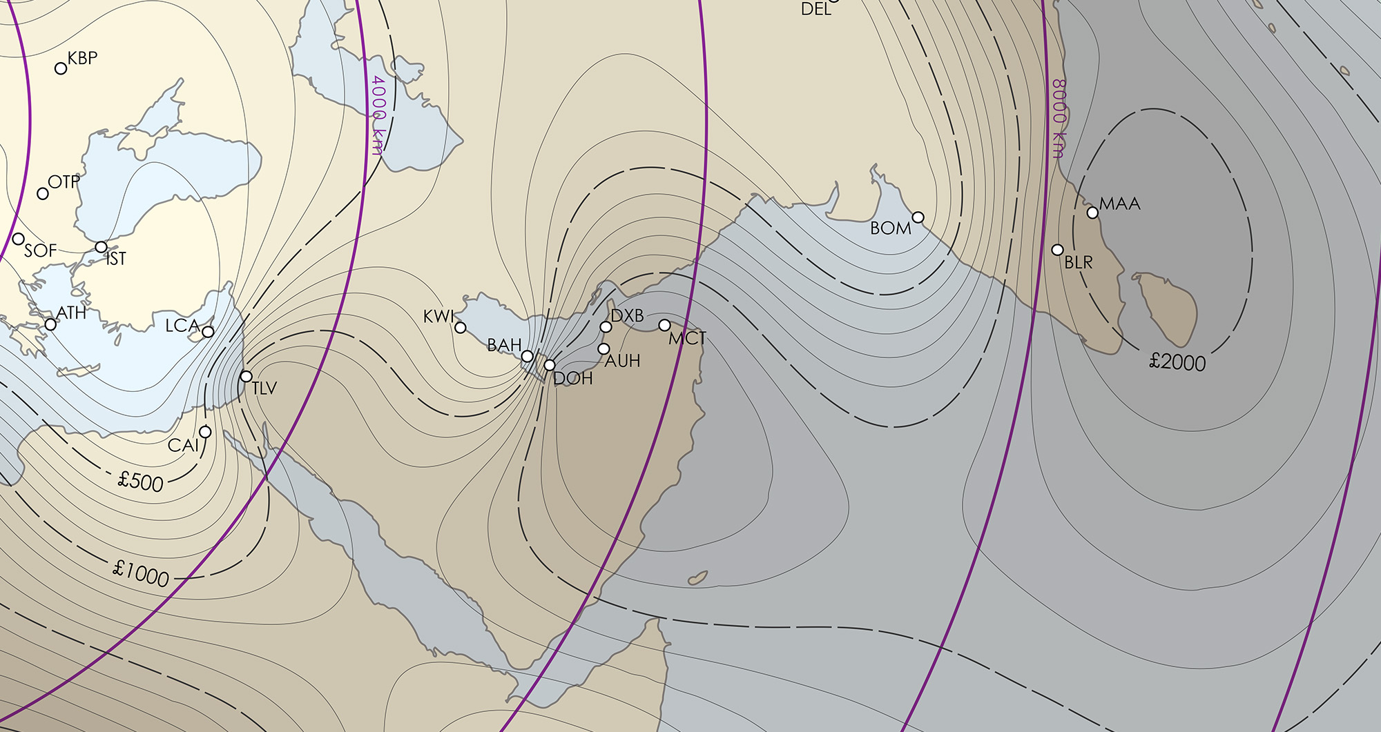
Anyone who has booked a flight probably knows that the cost is not necessarily proportional to the distance traveled. The question, then, is: how does it vary spatially? I put this map together to show the answer for one airline at one airport on one week. I collected fares for all 100+ direct international flights on British Airways out of Heathrow airport in London, interpolated a global surface, and threaded isolines.
Arguably, this is the wrong symbolization technique. Airfare doesn’t vary continuously across the surface of the globe. Only a few points have airfares — you can’t fly to middle of the Pacific Ocean, for example. But if I had chosen a more conventional symbolic technique, such as a proportional symbol, I think the wide empty spaces would have dominated the map too much. Isolines help keep the data up front, as well as provide a more visually interesting presentation,
Fun fact: if you look at the map from a distance, or squint, you can see a really interesting light and shadow effect.