Deaths in the Grand Canyon
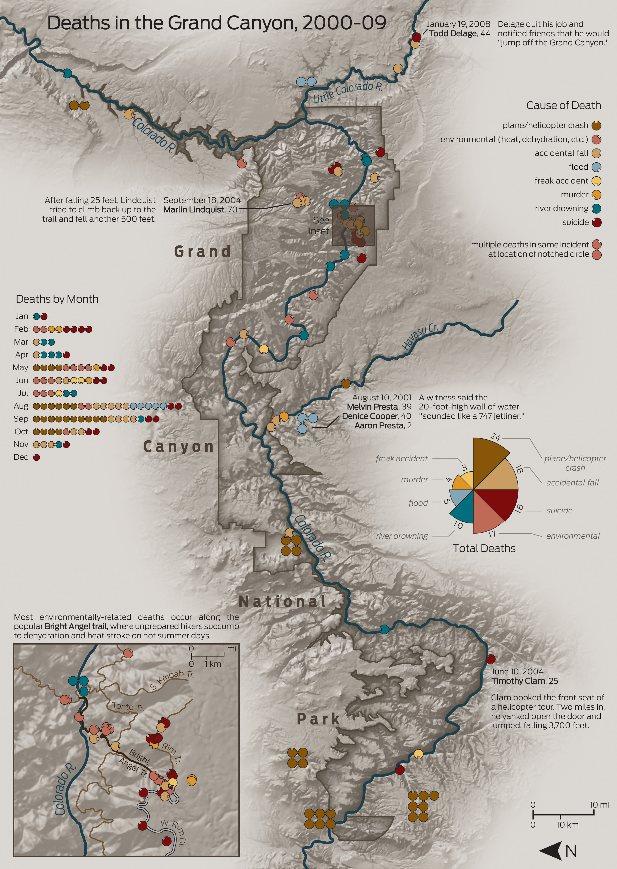
February 2010The symbols convey the cause of death in two ways: the color, and the location of the notch. The latter is there as a backup method for those who have color vision impairments. That’s somewhere in the neighborhood of 5% of the American population, so we’re talking millions of people. I’ve never quite understood why so many designers ignore them, or how they get away with it.
This was one of the first freelance projects I made, at which point I started to think that if people continued to pay me to make maps, maybe I wouldn’t have to get a real job.